
Dark Mode Light Mode
Ask the Expert — EASTside Magazine *, *::before, *::after :root { –forest: #1B3A2D; –sage: #4A7C59; –sage-light: #7FAF8A; –mint: #C8E6D4; –cream: #FAF6EF; –gold: #C9973A; –gold-light: #F0C96B; –charcoal: #1E1E1E; –warm-gray: #6B6560; –white: #FFFFFF; } body { font-family: ‘DM Sans’, sans-serif; background: var(–cream); color: var(–charcoal); line-height: 1.6; overflow-x: hidden; } .hero { background: var(–forest); position: relative; overflow: hidden; min-height: 520px; display: grid; grid-template-columns: 1.05fr 0.95fr; } .hero::before { content: ”; position: absolute; top: -60px; right: -80px; width: 500px; height: 500px; border-radius: 50%; border: 80px solid rgba(201,151,58,0.12); } .hero::after { content: ”; position: absolute; bottom: -100px; left: -60px; width: 400px; height: 400px; border-radius: 50%; border: 60px solid rgba(127,175,138,0.10); } .hero-inner { position: relative; z-index: 2; padding: 60px 40px 60px 64px; max-width: 900px; display: flex; flex-direction: column; justify-content: center; } .mag-badge { display: inline-block; background: var(–gold); color: var(–white); font-size: 11px; font-weight: 600; letter-spacing: 2px; text-transform: uppercase; padding: 6px 16px; border-radius: 2px; margin-bottom: 24px; width: fit-content; } .hero h1 { font-family: ‘Playfair Display’, serif; font-size: clamp(48px, 7vw, 80px); font-weight: 900; color: var(–white); line-height: 1; letter-spacing: -1px; margin-bottom: 16px; } .hero h1 em { font-style: italic; color: var(–gold-light); } .hero-sub { font-size: 18px; color: var(–mint); font-weight: 300; max-width: 520px; line-height: 1.5; margin-bottom: 36px; } .hero-channels { display: flex; gap: 12px; flex-wrap: wrap; } .channel-pill { background: rgba(255,255,255,0.1); border: 1px solid rgba(255,255,255,0.2); color: var(–white); font-size: 13px; font-weight: 500; padding: 8px 18px; border-radius: 100px; display: flex; align-items: center; gap: 8px; } .channel-pill .dot { width: 7px; height: 7px; border-radius: 50%; background: var(–gold-light); flex-shrink: 0; } .hero-visual { position: relative; z-index: 2; display: flex; align-items: center; justify-content: center; padding: 48px 64px 48px 20px; } .sample-card { width: min(100%, 450px); background: rgba(255,255,255,0.06); border: 1px solid rgba(255,255,255,0.12); border-radius: 18px; padding: 18px; box-shadow: 0 20px 50px rgba(0,0,0,0.22); backdrop-filter: blur(4px); } .sample-label { display: inline-block; background: rgba(201,151,58,0.18); border: 1px solid rgba(240,201,107,0.32); color: var(–gold-light); font-size: 11px; font-weight: 700; letter-spacing: 1.4px; text-transform: uppercase; padding: 6px 10px; border-radius: 999px; margin-bottom: 12px; } .sample-frame { border-radius: 12px; overflow: hidden; background: rgba(255,255,255,0.1); border: 1px solid rgba(255,255,255,0.16); } .sample-frame img { display: block; width: 100%; height: auto; } .sample-caption { font-size: 13px; color: var(–mint); line-height: 1.5; margin-top: 12px; } .gold-strip { background: var(–gold); padding: 18px 64px; display: flex; align-items: center; gap: 20px; flex-wrap: wrap; } .gold-strip .eyebrow { font-size: 11px; letter-spacing: 2px; text-transform: uppercase; font-weight: 700; color: rgba(255,255,255,0.7); white-space: nowrap; } .gold-strip p { font-family: ‘Playfair Display’, serif; font-size: 17px; font-style: italic; color: var(–white); } .main { padding: 64px; max-width: 900px; margin: 0 auto; } .section-label { font-size: 11px; letter-spacing: 3px; text-transform: uppercase; font-weight: 600; color: var(–sage); margin-bottom: 10px; } .section-heading { font-family: ‘Playfair Display’, serif; font-size: clamp(28px, 4vw, 40px); font-weight: 700; color: var(–forest); line-height: 1.2; margin-bottom: 20px; } .lead-text { font-size: 17px; color: var(–warm-gray); line-height: 1.7; font-weight: 300; max-width: 620px; margin-bottom: 48px; } .package-box { background: var(–forest); border-radius: 16px; overflow: hidden; margin: 48px 0; } .package-header { padding: 40px 48px 32px; position: relative; overflow: hidden; } .package-header::after { content: ”; position: absolute; top: -40px; right: -40px; width: 200px; height: 200px; border-radius: 50%; border: 40px solid rgba(201,151,58,0.12); } .package-tag { display: inline-block; background: var(–gold); color: white; font-size: 10px; font-weight: 700; letter-spacing: 2px; text-transform: uppercase; padding: 5px 14px; border-radius: 2px; margin-bottom: 16px; } .package-header h2 { font-family: ‘Playfair Display’, serif; font-size: clamp(26px, 4vw, 36px); font-weight: 700; color: var(–white); line-height: 1.2; margin-bottom: 8px; position: relative; z-index: 1; } .package-header p { font-size: 15px; color: var(–mint); font-weight: 300; position: relative; z-index: 1; } .channels-grid { display: grid; grid-template-columns: 1fr 1fr; gap: 2px; background: rgba(255,255,255,0.08); } .channel-card { background: rgba(255,255,255,0.04); padding: 28px 32px; display: flex; gap: 18px; align-items: flex-start; } .ch-icon { width: 46px; height: 46px; border-radius: 10px; background: rgba(201,151,58,0.18); border: 1px solid rgba(201,151,58,0.3); display: flex; align-items: center; justify-content: center; font-size: 20px; flex-shrink: 0; } .ch-text h4 { font-family: ‘Playfair Display’, serif; font-size: 16px; font-weight: 700; color: var(–white); margin-bottom: 5px; } .ch-text p { font-size: 13px; color: var(–mint); line-height: 1.5; font-weight: 300; } .price-row { padding: 28px 48px; display: flex; align-items: center; justify-content: space-between; gap: 24px; border-top: 1px solid rgba(255,255,255,0.1); flex-wrap: wrap; } .price-main { display: flex; align-items: baseline; gap: 10px; } .price-num { font-family: ‘Playfair Display’, serif; font-size: 52px; font-weight: 900; color: var(–gold-light); line-height: 1; } .price-label { font-size: 15px; color: var(–mint); } .price-note { font-size: 13px; color: rgba(255,255,255,0.5); max-width: 280px; line-height: 1.5; } .how-strip { display: flex; margin: 48px 0; border: 1.5px solid var(–mint); border-radius: 12px; overflow: hidden; } .how-step { flex: 1; padding: 28px 24px; border-right: 1.5px solid var(–mint); } .how-step:last-child { border-right: none; } .how-num { font-family: ‘Playfair Display’, serif; font-size: 44px; font-weight: 900; color: var(–mint); line-height: 1; margin-bottom: 8px; } .how-step h4 { font-size: 14px; font-weight: 600; color: var(–forest); margin-bottom: 6px; } .how-step p { font-size: 13px; color: var(–warm-gray); line-height: 1.5; } .why-box { border-left: 4px solid var(–gold); padding: 32px 36px; border-radius: 0 12px 12px 0; background: var(–white); margin: 48px 0; } .why-points { display: grid; grid-template-columns: 1fr 1fr; gap: 14px; margin-top: 24px; } .why-point { display: flex; gap: 12px; align-items: flex-start; } .check { width: 20px; height: 20px; background: var(–sage); border-radius: 50%; display: flex; align-items: center; justify-content: center; flex-shrink: 0; margin-top: 2px; } .check::after { content: ”; width: 5px; height: 9px; border: 2px solid white; border-top: none; border-left: none; transform: rotate(45deg) translateY(-1px); } .why-point p { font-size: 14px; color: var(–charcoal); line-height: 1.5; } .why-point strong { font-weight: 600; color: var(–forest); } .pull-quote { text-align: center; padding: 48px 40px; border-top: 1px solid var(–mint); border-bottom: 1px solid var(–mint); margin: 48px 0; } .pull-quote blockquote { font-family: ‘Playfair Display’, serif; font-size: clamp(20px, 3vw, 26px); font-style: italic; color: var(–forest); line-height: 1.5; max-width: 580px; margin: 0 auto 16px; } .pull-quote cite { font-size: 12px; color: var(–warm-gray); font-style: normal; letter-spacing: 1.5px; text-transform: uppercase; } .cta-section { background: var(–gold); border-radius: 16px; padding: 48px; text-align: center; } .cta-section h2 { font-family: ‘Playfair Display’, serif; font-size: clamp(26px, 4vw, 38px); font-weight: 700; color: var(–white); margin-bottom: 10px; line-height: 1.2; } .cta-section p { font-size: 15px; color: rgba(255,255,255,0.85); margin-bottom: 28px; } .cta-contact { display: inline-flex; flex-direction: column; gap: 4px; background: var(–white); padding: 20px 40px; border-radius: 8px; } .cta-contact .name { font-weight: 700; font-size: 18px; color: var(–forest); } .cta-contact .email { font-size: 15px; color: var(–sage); } .cta-contact .web { font-size: 12px; color: var(–warm-gray); letter-spacing: 1px; text-transform: uppercase; } footer { text-align: center; padding: 28px 64px; font-size: 12px; color: var(–warm-gray); letter-spacing: 1px; text-transform: uppercase; } @media (max-width: 940px) { .hero { grid-template-columns: 1fr; } .hero-inner { padding: 44px 28px 24px; } .hero-visual { padding: 0 28px 36px; } } @media (max-width: 680px) { .main, footer { padding: 36px 28px; } .gold-strip { padding: 16px 28px; } .channels-grid, .why-points { grid-template-columns: 1fr; } .package-header, .price-row { padding: 28px; } .how-strip { flex-direction: column; } .how-step { border-right: none; border-bottom: 1.5px solid var(–mint); } .how-step:last-child { border-bottom: none; } .cta-section { padding: 36px 28px; } }
EASTside Magazine · 2026

Ask the
Expert.

One powerful placement. Four channels working together to make you the real estate authority Austin turns to first.
Full-Page Print Ad
Social Media Post
Email Blast
Online Content
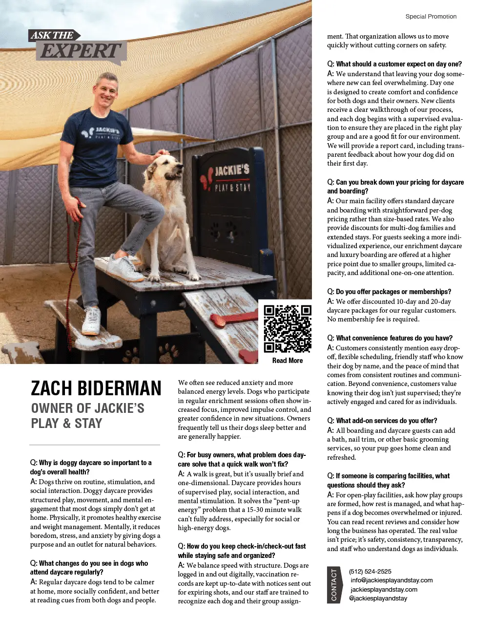
Sample feature layout
Sample Ask the Expert magazine spread with Zach Biderman and Jackie’s Play & Stay

A real example of how the Ask the Expert format can look in print — editorial, image-forward, and built to highlight the person behind the business. ([eastsideatx.com](https://www.eastsideatx.com/wp-content/uploads/2026/03/Screenshot-2026-03-23-at-12.14.24-PM.webp))

One Buy. Four Channels.

“Be the expert Austin buyers already know and trust — before they ever pick up the phone.”

One ad buy.
Everywhere that matters.

Ask the Expert is a Q&A-format sponsored feature in EASTside Magazine. We send you 5–10 questions, you answer them in your own voice, and we publish your expertise across print, social media, email, and online. One investment. Four impressions.

Complete Package — One Price

The Ask the Expert Feature

One full-page placement. Four ways your ideal clients will discover you.

📰

Full-Page Print Ad

A commanding, full-page Q&A feature in EASTside Magazine — distributed across Austin to homeowners, buyers, and investors who actually read it.

📱

Social Media Post

A professionally written post published on our Instagram and Facebook, driving our engaged local following directly to your expertise.

✉️

Dedicated Email Blast

Your feature sent as a standalone eNewsletter to our full subscriber list — just you, no competition, landing directly in their inbox.

🌐

Online Content

Your feature published on eastsideatx.com so new readers keep finding you, sharing your advice, and referring you long after the issue prints.

$1,950
one-time investment

Ad materials due by the 5th of the month prior to publication. Payment required in advance.

Completely done for you.

01

We Send the Questions

You receive 5–10 curated questions tailored to your market and expertise.

02

You Answer in Your Voice

Answer in your own words. No scripts, no jargon — just your real expertise.

03

We Write, Design & Publish

Our team handles everything — print layout, social post, email blast, and online.

04

Clients Call You First

Readers who know and trust you reach out before they consider anyone else.

This isn’t just an ad.
It’s authority you can bank on.

Editorial builds trust. A Q&A feature earns far more reader confidence than a display ad ever could.

You’re the expert, not just a sponsor. Readers come to you with trust already built in.

Your exact market. Austin homeowners, buyers, and sellers — all in one place.

Four channels, one price. Print, social, email, and online all working together for you.

Zero time required. We write it, design it, post it, and send it. You just show up as the expert.

Full-page presence. Not a small corner ad — a commanding feature that stops readers cold.

“Your future clients are already reading EASTside. The question is — will they find you, or your competitor?”
EASTside Magazine · Austin, TX

Ready to become the expert
Austin calls first?

Spots are limited each issue. Ad materials due by the 5th of the month prior to publication.

Will Bowling eastsideatx.com
EASTside Magazine  ·  Austin, Texas  ·  eastsideatx.com  ·  Woman-Owned & Locally Operated Since 2016
Previous Post

Austin-Bergstrom Is Dreaming Big — And We're Here for It

Next Post

Zach Biderman: Owner of Jackie’s Play & Stay

Receive the latest news

Subscribe To Our Weekly Newsletter

Get notified about new articles